Top 5 most popular YouTube thumbnail trends for creators in 2024
Published: 4 Feb 2024
YouTube thumbnails are the book covers of the digital content world. An attractive thumbnail serves as a first impression, a click-worthy invitation to the viewer. As a creator, mastering the art of thumbnail design can significantly improve your channel’s traction, viewer engagement, and overall success.
In this constantly evolving digital era, staying up to date with the latest trends is paramount. Today, we shed light on the top 5 YouTube thumbnail trends to watch out for in 2024. We explore each trend, providing you with a comprehensive overview, practical tips, and plenty of inspiration to fuel your creativity.
Animated YouTube thumbnail trends
Animated thumbnails, characterized by lively motion and vibrant colors, mark the first trend on our list. YouTube creators worldwide are embracing this trend, enhancing their video’s visual appeal and sparking curiosity among viewers. Animated thumbnails breathe life into static imagery, creating a dynamic preview that immediately catches the viewer’s eye.
Examples of popular animated thumbnails range from 3D animations to subtle GIF-like movements. This trend has been adopted by creators in a wide variety of niches, from vloggers and gamers to educational channels and cookery shows.
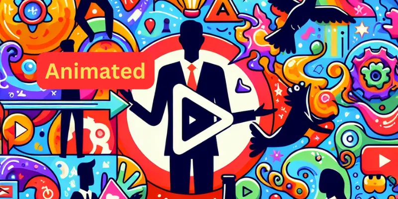

Animated thumbnails provide a slew of benefits. They make your content stand out amidst a sea of static thumbnails, create a sense of anticipation, and instantly convey that your content is exciting and engaging. To create an animated thumbnail, you can use tools like Adobe Premiere Pro or online platforms like Canva, which offer easy-to-use animation features.
Trend 2: Minimalism
Next up is the minimalism trend. The essence of minimalism in thumbnails lies in its simplicity – a clean, uncluttered layout that highlights the essential elements.
- Popular minimalist thumbnails often feature a single focal point, such as a product or a person.
- Bold, contrasting colors are used to create a visually striking effect.
- The use of negative space further enhances the subject, creating a distinct, memorable thumbnail.
Minimalist thumbnails strip away the unnecessary, placing the spotlight firmly on your content. They are easy to create, visually pleasing, and, more importantly, they perform exceptionally well across various devices and screen sizes.

Trend 3: Custom Illustrations YouTube thumbnail trends
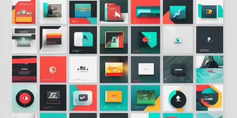
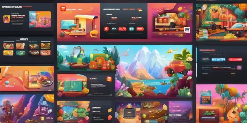
Custom illustrations for thumbnails open up a world of creativity beyond traditional photos and graphics. They offer a unique, artistic take on thumbnail design, enabling creators to express their brand personality and stand out.
Popular examples
Channels like Kurzgesagt and Draw with Jazza have mastered the use of custom illustrations, integrating them seamlessly into their branding.

Why use them?
Custom illustrations provide a fresh, eye-catching aesthetic, allow for greater consistency across your videos, and can make your thumbnails instantly recognizable.
How to create them?
There are endless resources available online to help you create your custom illustrations, or you can hire a professional illustrator.
Trend 4: Use of Text
Text-based thumbnails are not going anywhere anytime soon. The judicious use of text in thumbnails serves a dual purpose – it adds context and acts as a visual hook. Bold, concise text that complements your video title can significantly boost your click-through rate.
A quick look across popular channels will reveal a diverse array of text-based thumbnails. From punchy one-liners to intriguing questions, creators are leveraging the power of words to attract viewers.
However, there’s a fine line between adequate and excessive use of text. Flooding your thumbnail with too much text can make it look cluttered and confusing. The key is to keep it short, impactful, and easy to read, even on smaller screens.
Inevitable mistakes can sabotage your text-based thumbnails. Using fonts that are hard to read, choosing colours that blend into the background, or obscenity essential elements with your text can deter viewers.
Trend 5: Clickbait Thumbnails
Clickbait thumbnails, done right, can be a powerful tool to drive viewership. Here are some key elements to consider:
- A clickbait thumbnail needs to be intriguing, sparking curiosity in the viewer.
- They often feature exaggerated expressions, bold text, or surprising elements.
- The most important rule of clickbait thumbnails is to deliver on your promise. Misleading viewers can lead to a loss of trust and negatively impact your channel.
Conclusion
As we look ahead to 2024, it’s clear that YouTube thumbnails will continue to evolve, presenting creators with new opportunities to entice viewers and boost their channel’s performance. Staying updated with the latest trends and adapting to changing viewer preferences are the keys to success on this dynamic platform.
In conclusion, Youtube thumbnail trends whether you opt for animated thumbnails, embrace minimalism, experiment with custom illustrations, leverage text, or dabble in clickbait, remember that your thumbnail should be an accurate, enticing preview of your content. Experiment with different styles, test what works best for your audience, and continue to refine your approach.
Here’s a quick recap table of the top 5 thumbnail trends for 2024:
| Trend | Highlights | Advantages |
| Animated Thumbnails | Vibrant, Motion graphics | Attention-grabbing |
| Minimalism | Simple, Clean design | Effective across various screen sizes |
| Custom Illustrations | Unique, Artistic | Brand consistency |
| Use of Text | Bold, Concise text | Adds context, Visual hook |
| Clickbait Thumbnails | Intriguing, Surprising elements | Drives viewership, if done right |
What are the top 5 most popular YouTube thumbnail trends for creators in 2024?
The top 5 most popular YouTube thumbnail trends for creators in 2024 include eye-catching colors, bold typography, minimalistic designs, personalized illustrations, and emotional expressions.
How can using eye-catching colors in YouTube thumbnails benefit creators in 2024?
Using eye-catching colors in YouTube thumbnails can benefit creators in 2024 by attracting viewers’ attention and increasing the click-through rate. Vibrant and contrasting colors can make the thumbnail stand out among others and entice potential viewers to click on the video.
Why is bold typography considered a popular trend for YouTube thumbnails in 2024?
Bold typography is considered a popular trend for YouTube thumbnails in 2024 because it helps creators convey their video content or message more effectively. Using large, clear, and visually appealing fonts can make the thumbnail more readable and engaging, encouraging viewers to click and watch the video.
How can minimalistic designs in YouTube thumbnails be beneficial for creators in 2024?
Minimalistic designs in YouTube thumbnails can be beneficial for creators in 2024 because they provide a clean and uncluttered look. By using simple visuals, creators can capture the essence of their video without overwhelming the viewer. This can make the thumbnail appear more professional and enticing.
Why are personalized illustrations considered a popular YouTube thumbnail trend for creators in 2024?
Personalized illustrations are considered a popular YouTube thumbnail trend for creators in 2024 because they add a unique and personal touch to the thumbnail. By incorporating custom illustrations related to the video content or the creator’s branding, viewers can instantly recognize and connect with the content, leading to higher click-through rates and engagement.


- Be Respectful
- Stay Relevant
- Stay Positive
- True Feedback
- Encourage Discussion
- Avoid Spamming
- No Fake News
- Don't Copy-Paste
- No Personal Attacks


- Be Respectful
- Stay Relevant
- Stay Positive
- True Feedback
- Encourage Discussion
- Avoid Spamming
- No Fake News
- Don't Copy-Paste
- No Personal Attacks
