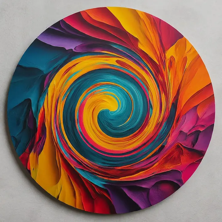
What color mode do you use for youtube thumbnails
Published: 23 Aug 2024
Have you ever wondered why some YouTube thumbnails immediately grab your attention while others seem to fade into the background? The secret often lies in the colors used. Thumbnails are like the cover of a book—they give viewers the first impression of your video. But it’s not just about picking any color; your color mode can significantly affect how your thumbnail appears on screens. This article explores why the correct color mode is essential and how to make the best choice for your YouTube thumbnails.
Understanding Color Modes: RGB vs. CMYK
Before diving into the best color mode for YouTube thumbnails, let’s understand the two main color modes: RGB and CMYK.
- RGB (Red, Green, Blue): This color mode is used in digital screens, like computers, phones, and TVs. Mixing these three colors in different amounts allows you to create almost any color. That’s why RGB is perfect for anything that appears on a screen.
- CMYK (Cyan, Magenta, Yellow, Key/Black): This mode is used in printing. It’s different from RGB because it subtracts colors from white light to create the colors you see in print. While CMYK is great for physical items like posters and flyers, it’s not ideal for digital screens.
Knowing the difference between these two color modes helps you choose the right one for your YouTube thumbnails.

Why RGB is Best for YouTube Thumbnails
When it comes to YouTube thumbnails, RGB is the winner. Why? Because YouTube and other online platforms are designed to display colors in RGB mode. If you use CMYK, the colors might look dull or different from what you expected.
In RGB mode, your colors will be vibrant and true to how they appear on your screen. This means that the bright red or deep blue you choose will pop out just the way you want it to, grabbing the attention of potential viewers.
Tips for Choosing the Best Colors in RGB Mode
Now that you know RGB is the best choice, here are some tips for picking the perfect colors for your thumbnails:
- Use High Contrast: Colors that contrast nicely with each other, like black and white or blue and yellow, make text and images stand out. This helps your thumbnail be more eye-catching.
- Bright and Bold Colors: Bright colors like red, yellow, and green are great for catching attention. Use them in your thumbnails to make them pop.
- Keep It Simple: Don’t overload your thumbnail with too many colors. Stick to two or three primary colors to keep it clean and easy to read.
- Test Your Thumbnails: Before finalizing your thumbnail, check how it looks in different sizes. Ensure the colors and details are apparent even when the thumbnail is small.
Common Mistakes to Avoid in Thumbnail Color Selection
Even though color is essential, it’s easy to make mistakes when choosing the right ones. Here are some common mistakes to avoid:
- Poor Color Combinations: Some colors don’t work well together. For example, red text on a green background can be hard to read. Stick to color combinations that are easy on the eyes.
- Low Contrast: If your text is too similar in color to the background, it will be hard to read. Always aim for high contrast to make your text stand out.
- Overusing Bright Colors: While bright colors are great, using too many can be overwhelming. Balance bright colors with neutral ones to create a visually appealing thumbnail.
Conclusion:
Choosing the correct color mode for your YouTube thumbnails makes them stand out. RGB is the best choice because it ensures your colors are vibrant and eye-catching on screens. Remember to use high contrast in a simple color palette and avoid common mistakes when creating thumbnails that attract viewers. You can boost your video’s appeal and draw more clicks by making thoughtful color choices.
Now that you know what color mode to use, experiment with different colors in your thumbnails. See what works best for your content and audience, and watch as your videos get more attention

- Be Respectful
- Stay Relevant
- Stay Positive
- True Feedback
- Encourage Discussion
- Avoid Spamming
- No Fake News
- Don't Copy-Paste
- No Personal Attacks


- Be Respectful
- Stay Relevant
- Stay Positive
- True Feedback
- Encourage Discussion
- Avoid Spamming
- No Fake News
- Don't Copy-Paste
- No Personal Attacks


